User Experience Comes First
Arizona websites aim to not only be visually appealing, but also deliver the best user experience possible to a wide variety of audiences. In order to do this successfully, many factors need to be considered such as:
- Analytics & Data
- Research & Testing
- Information Architecture
- Content & SEO
- Wireframing & Prototyping
- Accessibility
- Development
- and more
Ideally, all these aspects of user experience design should be utilized to ensure you’ve accounted for your user’s needs and goals. This will also help remove your own personal biases out of the decision making process. For a more detailed view of the website creation process, please visit our Web Project Workflow page.
UX Resources
There are many resources available to help you learn more about User Experience design - one of which is right here on campus. UX@UA has created a robust website of information and learning resources for user experience and hosts monthly meetups to help build knowledge and network with others in the UX community.
These just scratch the surface of what is available online. UX@UA has created a larger list of resources here or simply searching google will lead to a plethora of valuable information.
Arizona Website Visual Style
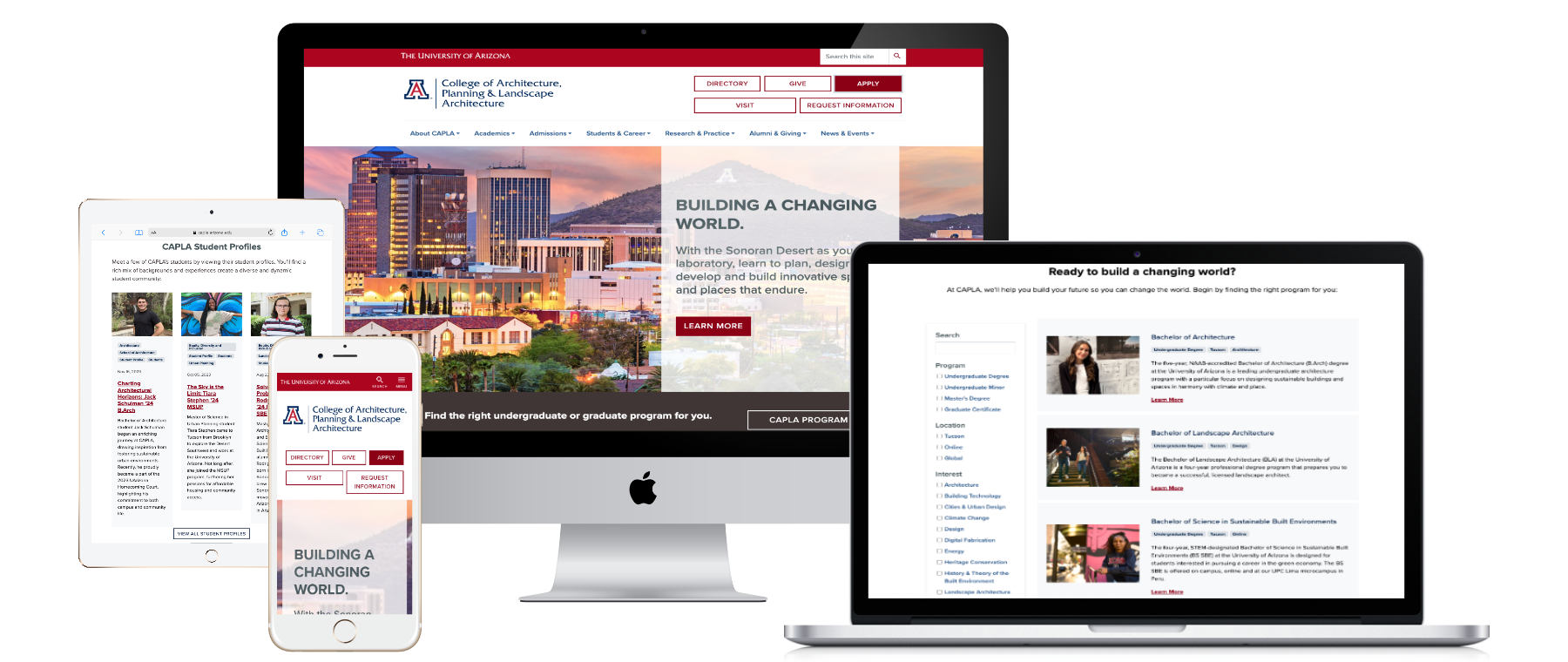
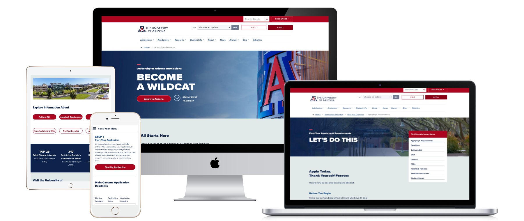
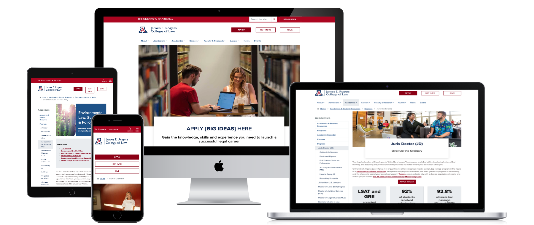
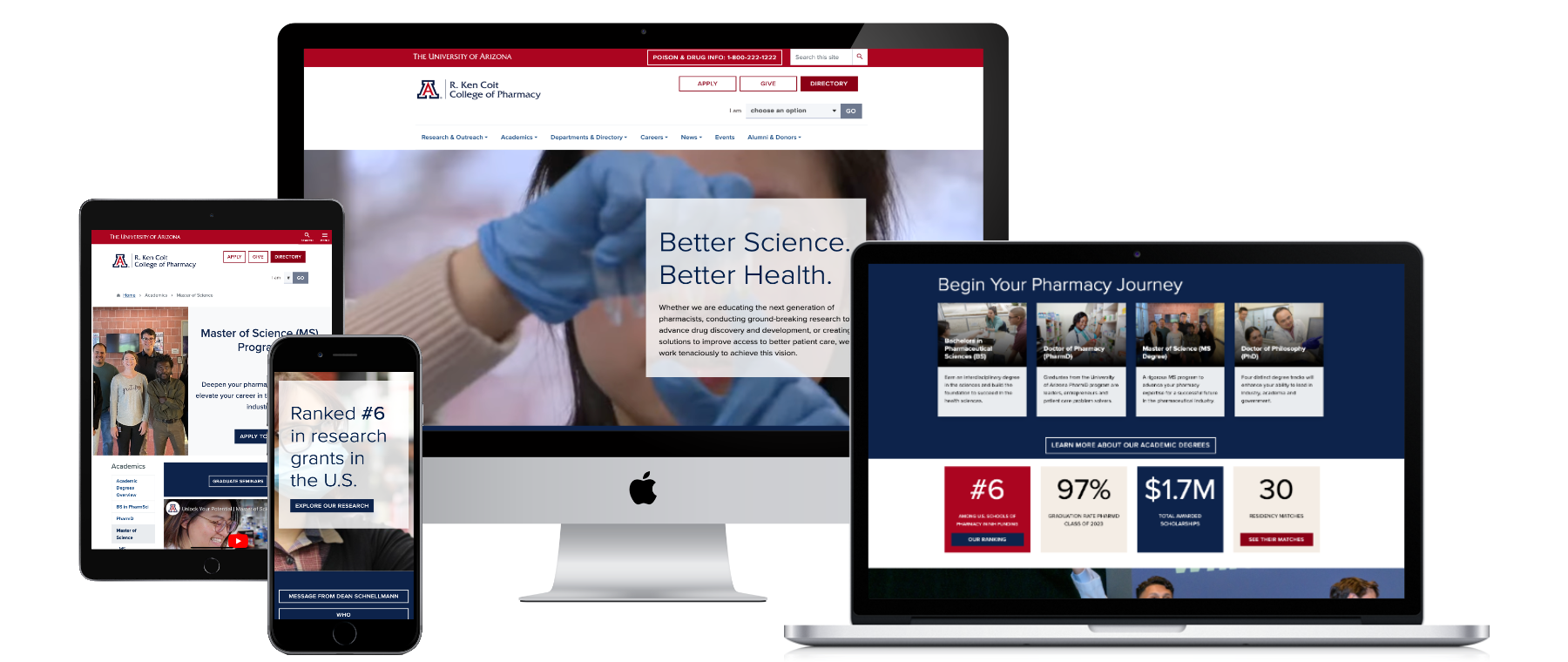
Part of a good user experience is having an attractive, consistent and intuitive User Interface (UI). This includes the use of white space, color, typography, and various visual components like icons, buttons, and images. Utilizing the available UI components through Arizona Bootstrap is a great way to ensure you create a branded website that is cohesive with the rest of the Arizona website ecosystem.
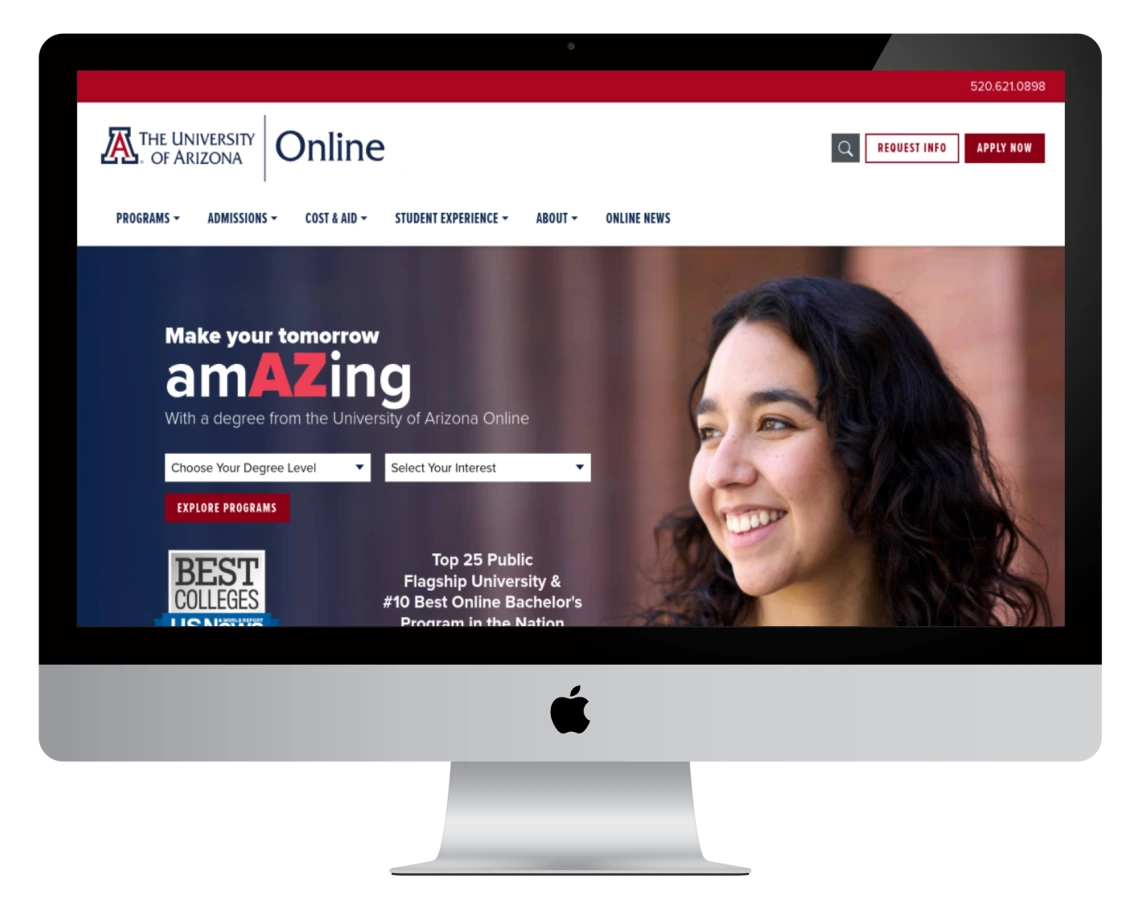
Below are examples of Arizona websites to help inspire you.
Wireframes/Prototypes
Before you start building a website, it's crucial to create wireframes and prototypes. Wireframes help you plan the layout of content and overall structure of the pages of your website, while prototypes give you a clear idea of how your website will look and function with final colors, content, interactions and images.
Not a designer? Creating a Branded Website is Easier Than Ever
At the University of Arizona, we offer Quickstart (Drupal Content Management System). Quickstart is perfect for creating a website with minimal effort. By utilizing the available Arizona Bootstrap components through Quickstart, you can ensure your website is branded and cohesive with the rest of the Arizona website ecosystem.
Accessibility
Accessibility is an essential aspect of user experience design for web and by law the University is required to meet ADA compliance. This includes proper color contrast, content formatting, image descriptions, avoiding text in images and more.
To ensure your website is accessible to all, we recommend using DubBot, the university's tool for crawling your website and providing an accessibility report. You can request access to DubBot through our IT Accessibility Consultation Request Form.
Handing off to Development
Once you have designed your website and it has been approved, it is essential to hand it off to development. Generating a link with development specifications from either Figma or Adobe XD is easy and provides the development team what they need to begin work. That being said, it is always best to meet with developers and discuss the design to ensure there are no technical restrictions and they have all the information and assets they need.
Saving Assets for Web:
Optimizing assets for the web is a crucial final step in the content creation process. During prototyping, images should be selected that reflect and support the Arizona brand. Assets may be sourced from the Digital Asset Library or created independently. Before uploading, confirm that each image is sized appropriately, saved in RGB color mode, and optimized for web use.
Large image file sizes slow down page load times, which negatively impacts the user experience and can cause visitors to leave the site before it finishes loading. Search engines also factor page speed into rankings; oversized image files can reduce visibility in search results. Additionally, smaller file sizes enhance accessibility for users on mobile devices or those with limited bandwidth. By compressing images, you ensure pages load quickly, perform better in search, and provide a smoother experience for all users. To reduce file size while maintaining quality, compress WEBP, JPEG, and PNG images using tools such as TinyPNG.com
Conclusion
Creating a university branded website is an exciting and challenging process, but with the resources available, it can be a rewarding experience. We hope this guide has been helpful, and we look forward to seeing your branded websites.


