Primary Typefaces
Our typography system balances tradition with modernity. Proxima Nova provides a clean, approachable foundation for everyday communications while Garamond Premier Pro provides a stately, avuncular serif that conveys a classic, collegiate tone and feel.

Proxima Nova
Our primary sans serif, Proxima Nova is clean, modern, and highly legible. Use it for body copy, digital experiences, and everyday communications where clarity and accessibility are the priority.

Proxima Nova Condensed
A space-efficient extension of Proxima Nova, this condensed typeface creates visual impact without sacrificing readability. Use it for headlines, subheads, callouts, navigation, and layouts where space is limited.

Garamond Premier Pro
A timeless serif that brings warmth, sophistication, and academic tradition to the brand. Use it for feature headlines, pull quotes, long-form storytelling, and moments that call for a more elevated, collegiate voice.
Complementary Typefaces
To expand our creative tool chest, we've introduced Fenway Banner Variable and Hepta Slab. These complementary typefaces add greater flexibility and expressive range while remaining true to the brand pillars and personality. Whether creating a bold campaign headline, a feature story, a research publication, or a digital experience, each typeface has a distinct role to play depending on the audience and situation.

Fenway Banner Variable
Bold, expressive, and full of personality, Fenway Banner Variable is designed to capture attention. Use it selectively for campaign headlines, promotional graphics, and high-impact moments where a distinctive visual statement is needed.

Hepta Slab
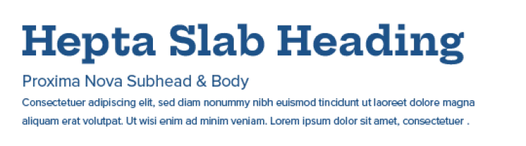
A contemporary slab serif that blends confidence with approachability. Use it to add emphasis to headlines, research publications, editorial layouts, and other applications that benefit from a strong, authoritative presence while remaining approachable.
Alternative Typefaces
Alternative fonts ensure consistency when our primary typefaces aren't available. Use these system fonts for Microsoft Office applications and other environments where brand fonts cannot be installed, helping maintain a polished and professional appearance.

Calibri
Calibri is our alternate sans-serif font meant for everyday uses in Microsoft Office (Word, PowerPoint, Excel and Outlook). This includes Trellis Marketing Cloud for our e-communications.

Times New Roman
Times New Roman is our alternative serif font, reserved for formal documents in Microsoft Office.
Typography Principles
Typography is most effective when fonts complement one another and don’t compete for attention. Because we’ve expanded our secondary font choices, you'll find recommended font pairings that establish clear hierarchy, improve readability, and create a consistent visual rhythm across communications.


Typeface Pairings
Choose typography with intention. Every typeface should have a job to do, and they should work together to make every message more powerful and easier to understand. It’s highly suggested to limit your font family and style choices. When in doubt, never use more than three total typeface variations.