Logos vs Supporting Graphics
Your University unit may want to create its own supporting graphics, such as icons, geometric designs, patterns, and shapes to distinguish yourself and better communicate your relevant messages. Guidelines for supporting graphics ensure the University communicates with a coordinated visual expression.
In addition to the official University logos, other supporting graphics may be developed to establish a more distinctive look within the brand standards. Graphic elements should be shared with University Marketing & Brand Management to ensure brand compliance. Submit graphic elements for review via email to brand@arizona.edu.
Do’s and Do Not’s of Supporting Graphics
Do embrace your approved University logo as your primary mark.
Do express your brand distinctiveness through creative use of geometric designs, patterns and/or shapes.
Utilize colors from the brand palette considering Arizona Blue and Arizona Red as primary colors.
Use a professional designer to ensure that the University's brand guidelines are followed. University resources for designers are available or you can seek designers from the Agency & Vendors list. If you are using outside designers, make sure all rights to any work are assigned to the University in perpetuity.
Do not combine typography and text with supporting graphics, especially with a unit name or acronym. This can easily be perceived as an official University logo, and repeated use of a supporting graphic as a logo mark is strictly prohibited.
Do not use supporting graphics within an official University logo.
Examples of Work
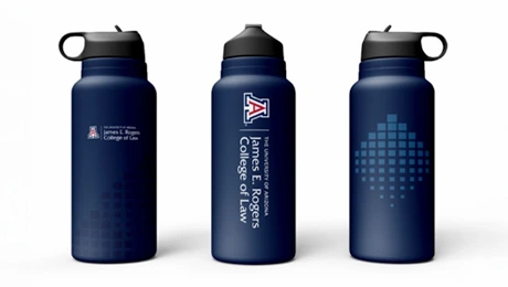
The following examples are supporting graphics specifically created for the College of Law.
Official Logo Lockup vs. Supporting Graphic vs. Unsanctioned Logo
CORRECT:

Official Logo Lockup
CORRECT:

Supporting Graphic
INCORRECT:

Graphic Element with Type
Supporting Graphics in Context

In this example, note how the design and the official logo are kept separate from one another. These graphic elements are part of the overall design and don’t break any identity/brand rules, as this is a single-page communication with the unit’s lockup placed at the top of the page. The orientation of these elements should not be extracted from the page to appear as a primary mark in other communications collateral.
Instead, these supporting graphics, in conjunction with the unit’s sanctioned lockup, can be effectively utilized elsewhere, such as promotional merchandise.
When using supporting graphic elements in proximity to University marks or lockups, please adhere to the proper amount of clear space.

Get Involved
General supporting graphics that can be used across the University are in development. If you would like a consultation on the development and use of supporting graphics for your individual college or non-academic unit, please contact Frank Camp (non-academic units) or Jenna Rutschman (colleges).

